Profile Pro
Adyghe
Afrikaans
Albanian
Älvdalska
Amharic (Ethiopic romanization)
Aragonese
Archi
Arumanian
Arvanitika (Greek)
Arvanitika (Latin)
Asturian
Avaric
Azerbaijani (Latin)
Balk
Baraba Tatar
Basque
Bats (Latin)
Belarusian (Cyrillic)
Belarusian (Latin)
Bislama
Bosnian (Cyrillic)
Bosnian (Latin)
Botlikh
Breton
Budukh
Bulgarian
Bulgarian (Cyrillic romanization)
Buriat
Burmese (Burmese romanization)
Catalan
Chamorro
Chechen (Cyrillic)
Chichewa
Cook Islands Maori
Crimean Tatar (Latin)
Croatian
Czech
Danish
Dargin
Dungan
Dutch
English
Erzya
Esperanto
Estonian
Faroese
Finnish
Franco-Provencal
French
Frisian
Frisian · East
Frisian · North
Frisian · West
Friulian
Gagauz (Latin)
Galician
German
Ghodoberi
Greek (Greek romanization)
Greek Monotonic
Greenlandic
Greenlandic (pre-1973)
Hawaiian
Hungarian
Icelandic
Indonesian
Ingush
Interlingua
Irish
Istro-Romanian
Italian
Japanese (Sino-Japanese romanization)
Kabardian
Kalmyk
Kara-Kalpak
Karachay-Balkar
Karaim (Cyrillic)
Karaim (Latin)
Kashubian
Kazakh
Kazakh (Cyrillic romanization)
Kazan Tatar (Cyrillic)
Kazan Tatar (Latin)
Khinalug
Khmer (Khmer romanization)
Korean (Hangul romanization)
Kryts
Kumyk
Kurdish (Cyrillic)
Kurdish (Latin)
Kurmanji
Kyrgyz (Cyrillic romanization)
Ladin
Ladino (Latin)
Lak
Laotian (Laotian romanization)
Latin
Latvian
Lezgi
Lithuanian
Low German
Luxembourgian
Macedonian
Macedonian (Cyrillic romanization)
Malagasy
Malay (Latin)
Maltese
Manx Gaelic
Maori
Marshallese
Moksha
Moldavian (Latin)
Mongolian (Cyrillic romanization)
Mongolian (Cyrillic)
Nanai
Nogay
Norwegian · Bokmål
Norwegian · Nynorsk
Occitan
Pilipino (Tagalog)
Polish Portunhol Romani (Latin)
Portuguese
Rhaeto-Romance
Romanian
Romansch
Russian
Russian (Cyrillic romanization)
Russian (Cyrillic)
Rusyn
Rutul
Sami · Inari
Sami · Lule
Sami · Northern
Sami · Southern
Sami · Ume
Samoan
Sardinian
Scottish Gaelic
Serbian (Latin)
Slovak
Slovenian
Somali
Sorbian · Lower
Sorbian · Upper
Sotho · Northern
Sotho · Southern
Spanish
Swedish
Tabasaran
Tahitian
Tajik
Tajik (Cyrillic romanization)
Tatar
Tati
Tongan
Tsakhur (Cyrillic)
Tsakhur (Latin)
Tsakonian Monotonic
Tsonga
Tswana
Turkish
Turkmen
Turkmen (Cyrillic romanization)
Tuvinian (Tuvan)
Ubykh
Ukrainian
Ukrainian (Cyrillic romanization)
Uzbek
Uzbek (Cyrillic romanization)
Våmhusmål
Vepsian
Wallisian
Walloon
Welsh
Wolof
Xhosa
Yapese
Yiddish (romanization)
Zulu


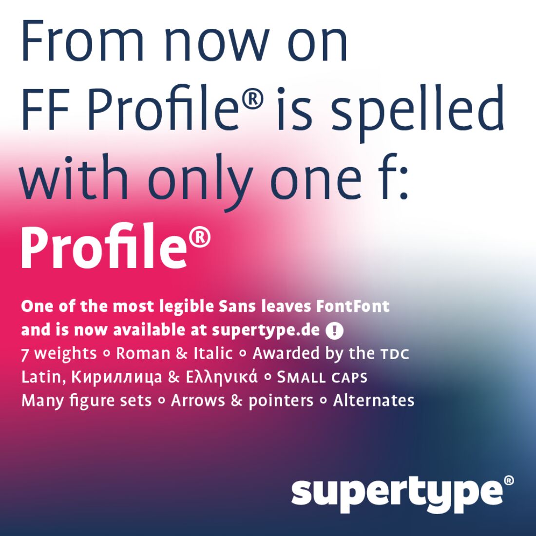
About Profile Pro
The following is a review of Profile® written by John D. Berry, who gave me his kind permission to use it here. Originally it was published on creativepro.com.
* * *
Profile of a Modern Sans Serif
One of those rules of thumb we love to repeat to ourselves, especially in the United States, is that sans serif typefaces are inherently less readable in extended text than typefaces that have serifs. Sans serifs, the logic goes, are mechanical and lifeless; they’ve sacrificed the subtle warmth of an old-style serif typeface to the cold, cruel logic of the machine age. Yet this assumption has been challenged over recent decades by a significant number of type designers, most of them in Europe, who seem intent on creating a sort of warm modernism.
[…] Profile® is one of a growing number of sans serif typefaces that are characteristically clean and spare in appearance but that have little to do with established sans serif categories — the clunky 19th-century tradition of serifless grotesques or the rational, modernist 20th-century tradition of geometrical sans serifs.
The Humanist Tradition
Of course every tradition needs an easily referenced and readily identifiable name, and these new variants march under the banner of “humanist sans serifs.” The name seems apt given their warmer design, but its genesis is well rooted in typographic history: These typefaces are based on the humanist handwriting of the 15th century and the old-style typefaces that followed them (and that dominated printing until nearly the time of the French Revolution).
Today’s humanist sans serifs follow those Renaissance forms, but they are stripped of their ornamentation and most of their contrast, reduced to their essential forms and then reconstituted in a variety of weights. One characteristic of almost all humanist sans serifs is that they have true italics, not just slanted romans as so many other sans serifs do.
Profile® was designed by Martin Wenzel, a […] German designer from Berlin who studied in the Netherlands […]. Even if you didn’t know he’d been a student at the Royal Academy for Fine and Applied Arts, in the Hague, it would be obvious to anyone with an eye for the fine points of type that he’d been influenced by the humanist Dutch typographic tradition. Profile® clearly grows out of some of the same ideas and concerns that gave us Petr van Blokland’s Proforma and Luc(as) de Groot’s Thesis. (It also has some details in common with Erik Spiekermann’s Meta, which approaches the same problems from a somewhat different direction.)
The challenge with a sans serif typeface like this is to make it varied enough for comfortable reading in long blocks of text, yet simple and unornamented enough to define its space on the page. It should suggest an uncluttered, modern, clearly delineated world.
Disclaimer: I’m judging Profile® entirely from printed samples; […] The samples make me want to try out the face in various designs and layouts, much the way The Sans appealed to me the very first time I saw it. Profile® has the same clarity and slim elegance that The Sans has, and a similarly open, spacious appearance. But Profile® has a slightly warmer, less stark look, because of detailing like the small, skewed swellings at the ends of some strokes. Without jumping around or being too lively, Profile® possesses a slight informality that makes it feel friendly.
Fine Details
Wenzel has given Profile® humanist characteristics in the roman, such as the open aperture and small eye on the lowercase “a” and “e,” as well as a traditional two-story “g.” The italic, he points out, “is gently oblique and runs a little narrower and lighter than the respective roman.” Both roman and italic are spaced generously, not crowded together like an advertising headline face. The ends of some of the strokes are asymmetrical; in the “v,” for instance, the angles of the ends of the two arms are different.
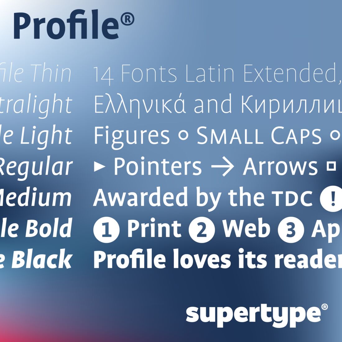
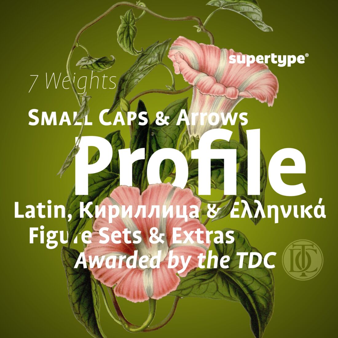
Profile® comes in [now seven] weights, and each includes roman, italic, small caps, and different sets of numerals: old-style (the standard), lining, monospaced old-style (for tables and columns of figures, as in an annual report), and small lining figures in both the superscript and subscript. Wenzel has provided a number of simple but useful ornaments, such as arrows in various directions and dotted lines and boxes […].
The Recipe
After describing some of the influences on the design of Profile® (and making the usual disclaimer that it wasn’t based directly on any particular face), Wenzel whimsically describes what he calls “the recipe”:
“Take the forms of classical typefaces based on writing with a broad nibbed pen (for example, a Garamond). Then, carefully reduce the contrast within the character shapes (the thicks and the thins) to a minimum. To finish, reduce the serifs so that only a little detail will remind us that they were once there. Serve unscaled and with enough leading.”
Not a bad recipe for the typographic cuisine of the 21st century. We have a lot of fine reading ahead of us.
* * *
Profile® was awarded a Certificate Of Excellence by the Type Directors Club.
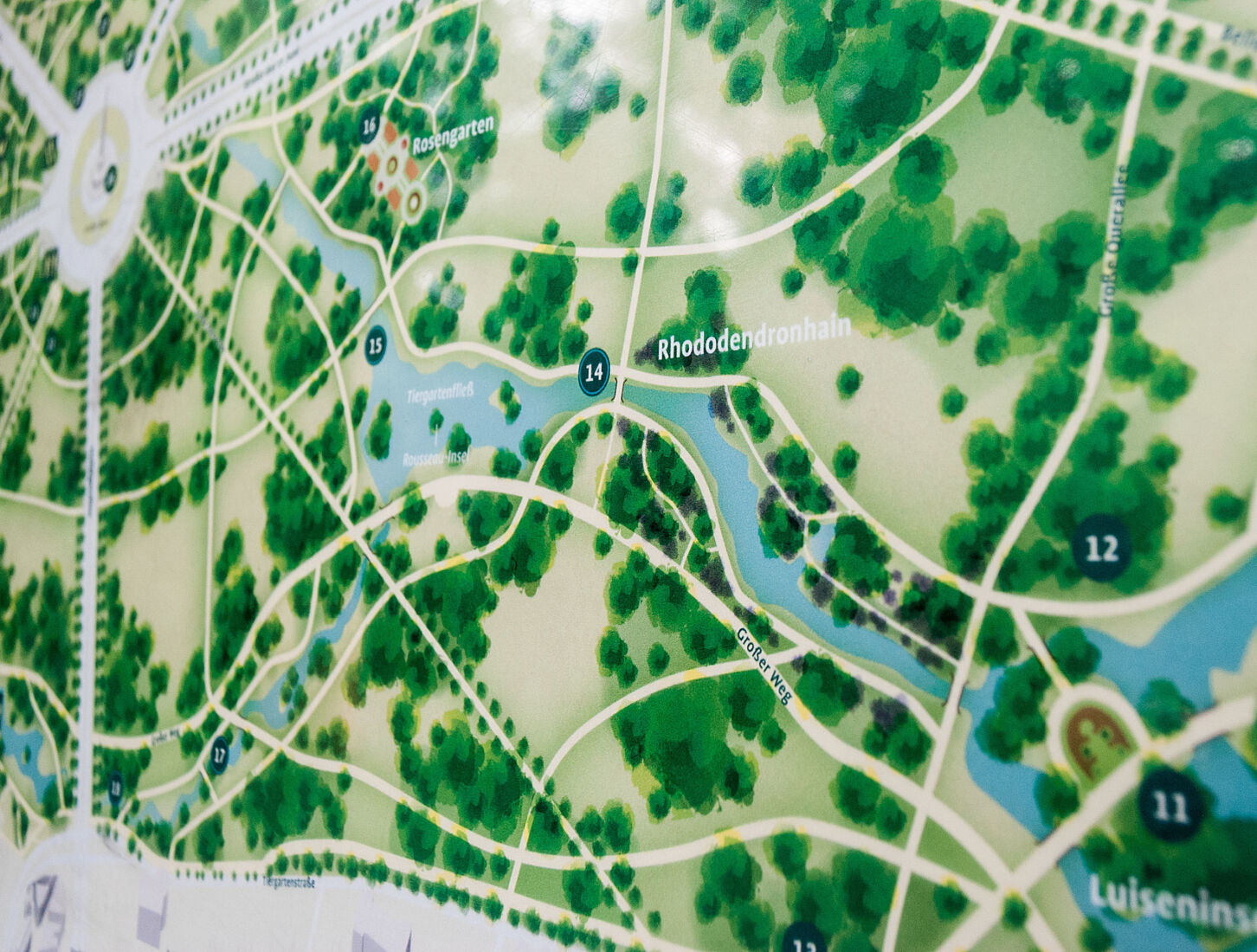
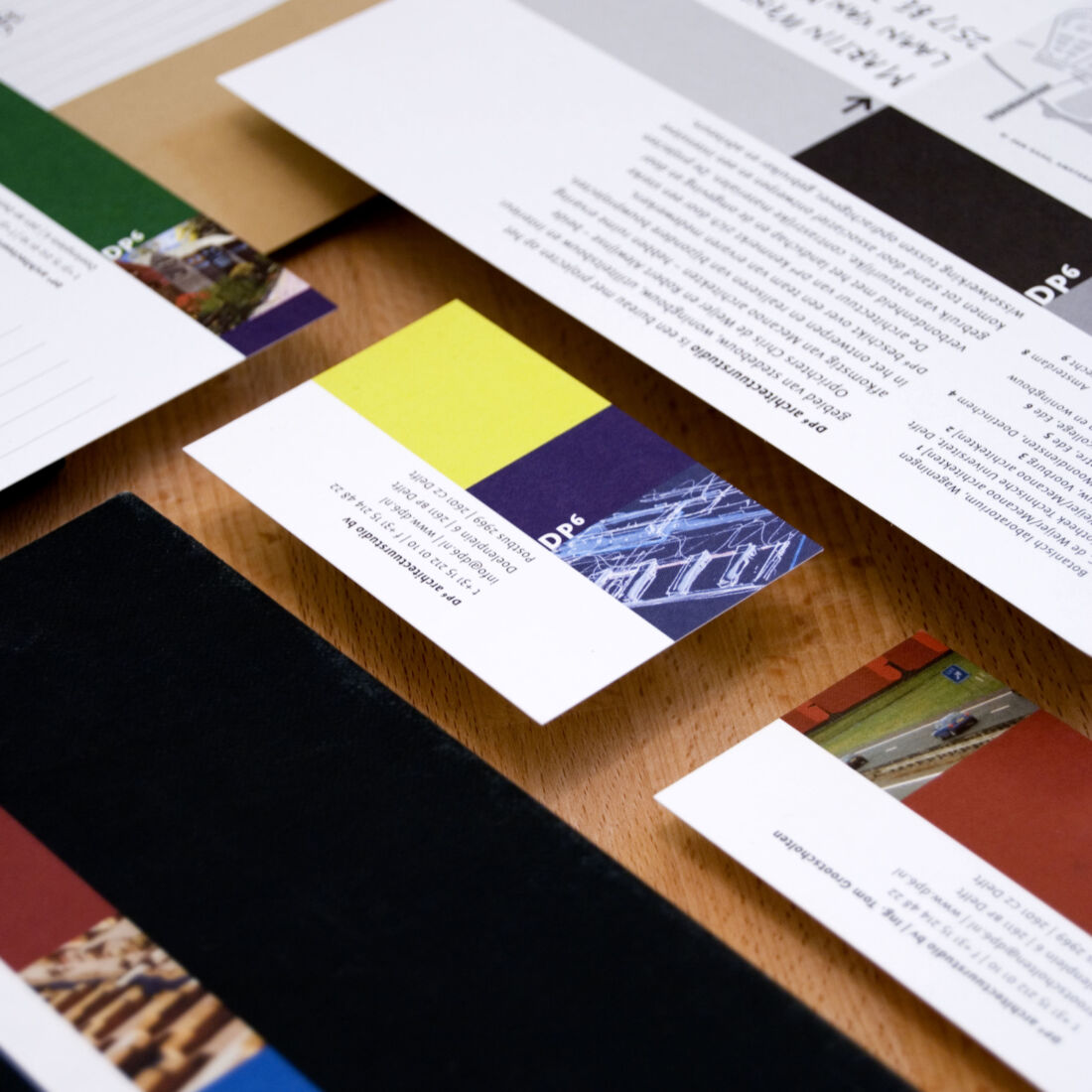
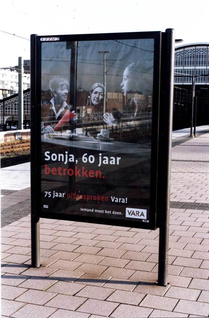
Fonts in use: The examples on top are a selection of works by Ulmer Publishers, the very fine design agency mingram, the amazing Austrian designer Clemens Theobert Schedler and the excellent Dutch designer Caro de Lint.
Buying Options
Get off 20% for multiple Single Fonts!