@font-face { font-family: 'custom_font_15179'; src: url('/assets/webfonts/custom/Volksbank_subset_for_website.woff2?15178') format('woff2'), url('/assets/webfonts/custom/Volksbank_subset_for_website.woff?15177') format('woff'); font-weight: normal; font-style: normal; }
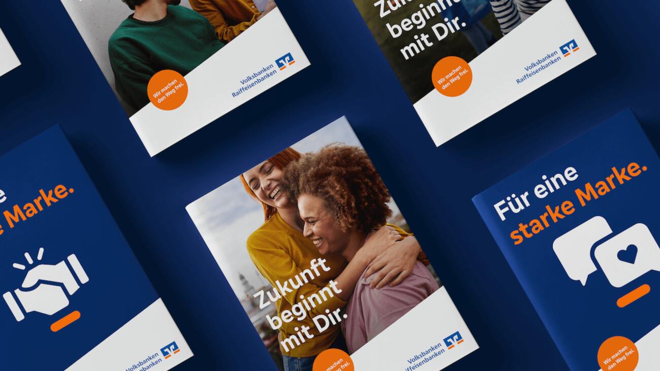
Volksbanken
Schrift macht den Weg frei ▶︎ wirDesign
@font-face { font-family: 'custom_font_15152'; src: url('/assets/webfonts/custom/HolcimBeta14-HeadlineBlack_subset.woff2?15154') format('woff2'), url('/assets/webfonts/custom/HolcimBeta14-HeadlineBlack_subset.woff?15153') format('woff'); font-weight: normal; font-style: normal; }
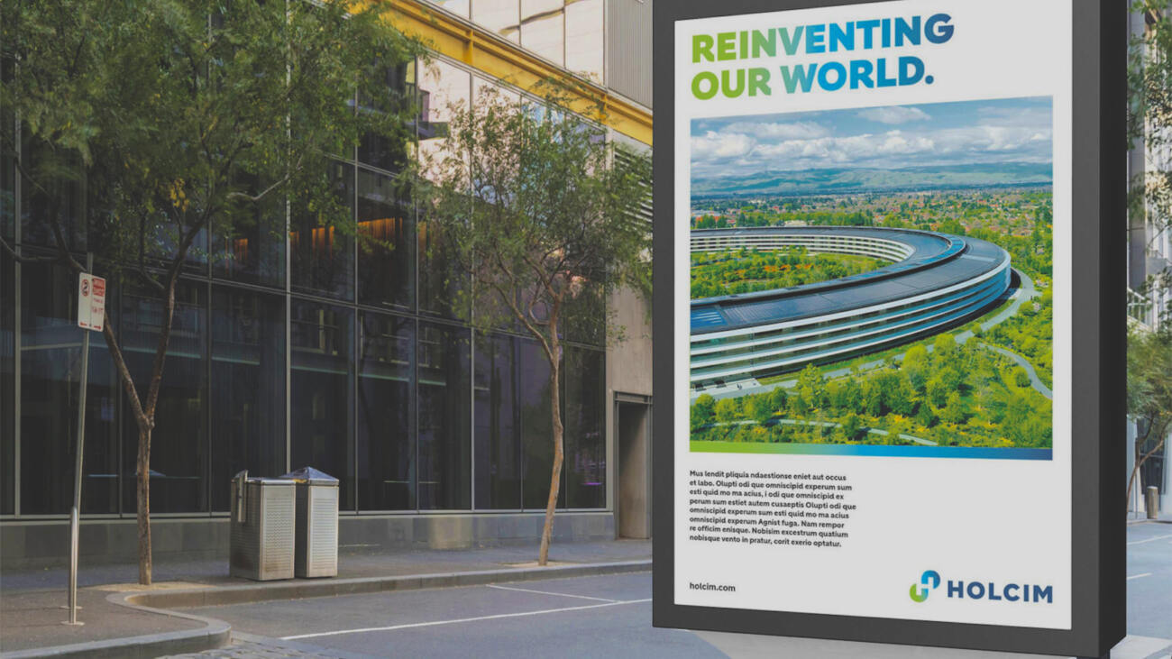
HOLCIM
Concrete Typography ▶︎ Peter Schmidt Group
@font-face { font-family: 'custom_font_7094'; src: url('/assets/webfonts/custom/HerthaHaHoHe-Black.woff2?7091') format('woff2'), url('/assets/webfonts/custom/HerthaHaHoHe-Black.woff?7090') format('woff'); font-weight: normal; font-style: normal; }
 
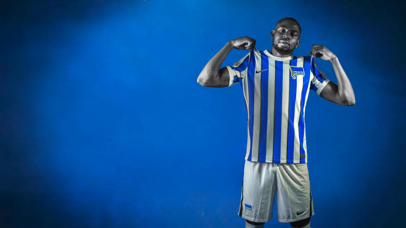
Headlines mit Schmackes! ▶︎ Hertha BSC
Zum Artikel
@font-face { font-family: 'custom_font_6542'; src: url('/assets/webfonts/custom/LidlFontPro-Bold_LatinOnlySubset.woff2?6540') format('woff2'), url('/assets/webfonts/custom/LidlFontPro-Bold_LatinOnlySubset.woff?6541') format('woff'); font-weight: normal; font-style: normal; }
Lidl
Einfach mehr Lebensfreude ▶︎ Peter Schmidt Group, superunion
Zum Artikel
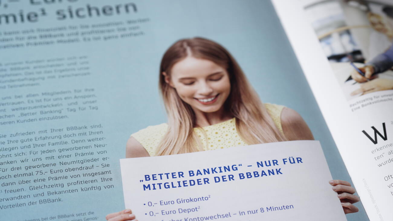
@font-face { font-family: 'custom_font_4456'; src: url('/assets/webfonts/custom/BBBankTT-Bold.woff2?4458') format('woff2'), url('/assets/webfonts/custom/BBBankTT-Bold.woff?4457') format('woff'); font-weight: normal; font-style: normal; }
BB Bank
Eine Schrift fürs Handeln mit „Bedacht und Plan“ ▶︎ Fuenfwerken
Zum Artikel
@font-face { font-family: 'custom_font_4424'; src: url('/assets/webfonts/custom/PeterSchmidtSans-MediumItalic.woff2?4433') format('woff2'), url('/assets/webfonts/custom/PeterSchmidtSans-MediumItalic.woff?4434') format('woff'); font-weight: normal; font-style: normal; }
 Peter Schmidt Group
Vierundzwanzig Fonts für eine Design Ikone ▶︎ Peter Schmidt Group
Zum Artikel
@font-face { font-family: 'custom_font_586'; src: url('/assets/webfonts/custom/DFBStencil-Regular.subset.woff2?1455') format('woff2'), url('/assets/webfonts/custom/DFBStencil-Regular.subset.woff?1454') format('woff'); font-weight: normal; font-style: normal; }
DFB
Das Runde und das Eckige ▶︎ Strichpunkt
Zum Artikel
@font-face { font-family: 'custom_font_577'; src: url('/assets/webfonts/custom/MMHeadlinePro-Regular.subset.woff2?855') format('woff2'), url('/assets/webfonts/custom/MMHeadlinePro-Regular.subset.woff?854') format('woff'); font-weight: normal; font-style: normal; }
MediaMarkt
Typografische Superlative ▶︎ Zeichen&Wunder
Zum Artikel
@font-face { font-family: 'custom_font_3364'; src: url('/assets/webfonts/custom/BundesMono-Bold_34_ps_dcmp.subset.woff2?3363') format('woff2'), url('/assets/webfonts/custom/BundesMono-Bold_34_ps_dcmp.subset.woff?3362') format('woff'); font-weight: normal; font-style: normal; }
Innenministerium
Schrift und Identität ▶︎ Bundesministerium des Innern
@font-face { font-family: 'custom_font_1449'; src: url('/assets/webfonts/custom/GOREFabrics-Light.subset.woff2?3040') format('woff2'), url('/assets/webfonts/custom/GOREFabrics-Light.subset.woff?3041') format('woff'); font-weight: normal; font-style: normal; }
GORE Fabrics
Für Texte über Textilien ▶︎ minigram
Zum Artikel
@font-face { font-family: 'custom_font_1731'; src: url('/assets/webfonts/custom/Suedtirol.subset.woff2?1730') format('woff2'), url('/assets/webfonts/custom/Suedtirol.subset.woff?1729') format('woff'); font-weight: normal; font-style: normal; }
ƒ Südtirol
Natürlich gewachsen ▶︎ Hejya / MetaDesign
Zum Artikel
@font-face { font-family: 'custom_font_579'; src: url('/assets/webfonts/custom/Giesinger_Brokenscript.subset_180927_155158.woff2?3359') format('woff2'), url('/assets/webfonts/custom/Giesinger_Brokenscript.subset_180927_155146.woff?3358') format('woff'); font-weight: normal; font-style: normal; }
Giesinger Bräu München
Buchstaben aus Hopfen, Hefe, Malz und Wasser ▶︎ Giesinger Brauerei
Zum Artikel
@font-face { font-family: 'custom_font_583'; src: url('/assets/webfonts/custom/Scheck-Sale.subset.woff2?1448') format('woff2'), url('/assets/webfonts/custom/Scheck-Sale.subset.woff?1447') format('woff'); font-weight: normal; font-style: normal; }
SportScheck
Sportlich, sportlich! ▶︎ MetaDesign Berlin
@font-face { font-family: 'custom_font_582'; src: url('/assets/webfonts/custom/MondaNew-Med.subset.woff2?1430') format('woff2'), url('/assets/webfonts/custom/MondaNew-Med.subset.woff?1429') format('woff'); font-weight: normal; font-style: normal; }
Staats Courant SC
Der Stil von Information ▶︎ Sdu Uitgevers
@font-face { font-family: 'custom_font_585'; src: url('/assets/webfonts/custom/Peaches-NineSeven.subset.woff2?1428') format('woff2'), url('/assets/webfonts/custom/Peaches-NineSeven.subset.woff?1427') format('woff'); font-weight: normal; font-style: normal; }
Words on Shirts
Pinsel plus Freude ▶︎ Words on Shirts
@font-face { font-family: 'custom_font_2998'; src: url('/assets/webfonts/custom/GlenDimplexSans-Bold.subset.woff2?2996') format('woff2'), url('/assets/webfonts/custom/GlenDimplexSans-Bold.subset.woff?2997') format('woff'); font-weight: normal; font-style: normal; }
Glen Dimplex
Berliner Interpretation eines Schweizer Klassikers ▶︎ Vince & Vert
Zum Artikel
@font-face { font-family: 'custom_font_580'; src: url('/assets/webfonts/custom/GSofA.subset.woff2?1733') format('woff2'), url('/assets/webfonts/custom/GSofA.subset.woff?1732') format('woff'); font-weight: normal; font-style: normal; }
Die Architektur einer Schrift ▶︎ MetaDesign Berlin
@font-face { font-family: 'custom_font_581'; src: url('/assets/webfonts/custom/HTWBerlinWeb-Plakat.woff2?669') format('woff2'), url('/assets/webfonts/custom/HTWBerlinWeb-Plakat.woff?595') format('woff'); font-weight: normal; font-style: normal; }
Hochschule HTW Berlin
Typo für Teckies ▶︎ HTW Berlin
Zum Artikel
@font-face { font-family: 'custom_font_578'; src: url('/assets/webfonts/custom/BundesSerif-Medium.subset.woff2?3361') format('woff2'), url('/assets/webfonts/custom/BundesSerif-Medium.subset.woff?3360') format('woff'); font-weight: normal; font-style: normal; }
Die Bundesregierung
Demokratische Schriften ▶︎ MetaDesign Berlin
Zum Artikel

You Cannot Not Use Type

Typography is everywhere in communication design and influences the meaning and character of a message. Choosing a custom typeface will improve that message by underlining your philosophy and culture. We design typefaces that reflect your corporate personality, in any media, on any device.

Design

With sense and sensibility

The character of a corporate typeface depends on its proportions, the contrast of the letter forms, and possibly the shape of serifs. These physical attributes give expression to the written word, beyond just its surface meaning.

At supertype® we approach the design of a typeface with sense and sensibility. Understanding and utilising our clients’ individual company values, we define the formal characteristics they wish to see reflected in their typeface and corporate design identity. Together we test our initial designs until all parties are satisfied with the basic characteristics of the key letter shapes. Only then do we follow through with the development of glyphs in all weights and styles, as well as the technical differentiation required for use on all platforms and media.

Technology

Font = Design + Software

OS/2 table, liga, calt, … the lingo of font technology today is confusing, but we cover the technicalities associated with making your corporate typeface work well in all media and platforms, making the fall back to system fonts obsolete.

Beyond the aesthetics, fonts are essentially software containing intelligence that further defines how they look and function. Examples of this are OpenType features that control ligatures or support language-sensitivity, and hinting which optimises the display of fonts for the screen. These technologies demand precision and skill to ensure the optimal use of fonts worldwide.

12 Good Reasons

Why a custom typeface is a good idea

There are many requirements for a typeface to work seamlessly within a certain context, which is why an off-the-shelf font is often not the ideal solution. The three main pitfalls of a retail font are licensing, aesthetics and functionality. The license agreement of an existing font may not allow its usage on your desired platform or may entail fees which are too high. An off-the-shelf font might also lack the typographic features (small caps, arrows, figure sets or your logo design) required in your company’s everyday work flow. The final challenge is to find the right ‘look’ in an existing typeface – one that works for all your company’s communication and expresses the unique quality of your corporate culture. We would be happy to visit your offices and discuss these and the other potential benefits of a type design tailored to your individual needs.

Off-the-shelf fonts will always have restrictions such as extra license fees for additional users or platforms, while custom type design offers you control over your costs and full freedom of usage.

System FontRetail FontCustom Font
Expression of character
Unique Characteristics
License-free for Additional Users
License-free for Additional Font Formats
Additional Language Support
Optimised Screen Display
Multiple Figure Sets and Small Capitals
Harmonising Sans and Serif
Integrated Customised Symbols
Optimised to Workflow
No data protection issues: clients host the fonts themselves; no data is being collected by third party
No staff needed to check on license agreement compliance

Pricing

Starting at € 6,500.— for a Sans Serif

To give you a rough idea of the costs and timing involved we have assembled this example calculation based on a sans-serif typeface with a Latin Extended glyph set (approximately 450 glyphs). Depending on the size of your company we have used different multipliers which influence the end price. Keep in mind this should only be taken as an indication — we are enthusiasts willing to compromise for the challenges of an exciting assignment. Our delivery time for a type design concept is approximately four weeks. The design of one font takes roughly 6 weeks while multiple fonts with extended glyph sets including Greek and Cyrillic, may take several months. Further details can be provided in a full written estimate based on your specific needs.

Example calculationLocal company, non-exclusiveInternational corporation, world-wide exclusivity
Base price Sans Serif,
Latin Extended glyphset
6,500.— Euro 6,500.— Euro
License/client factor × 1.0 × 2.5
3 Fonts, Regular, Bold and Italic for example × 3 × 3
Font production for 3 fonts + 4,500 + 4,500
Price (one-time payment) = 24,000 € = 53,250 €

Sounds great?

Get in touch with us for a detailed look at your project and how we can help create a font which suits your company the best!